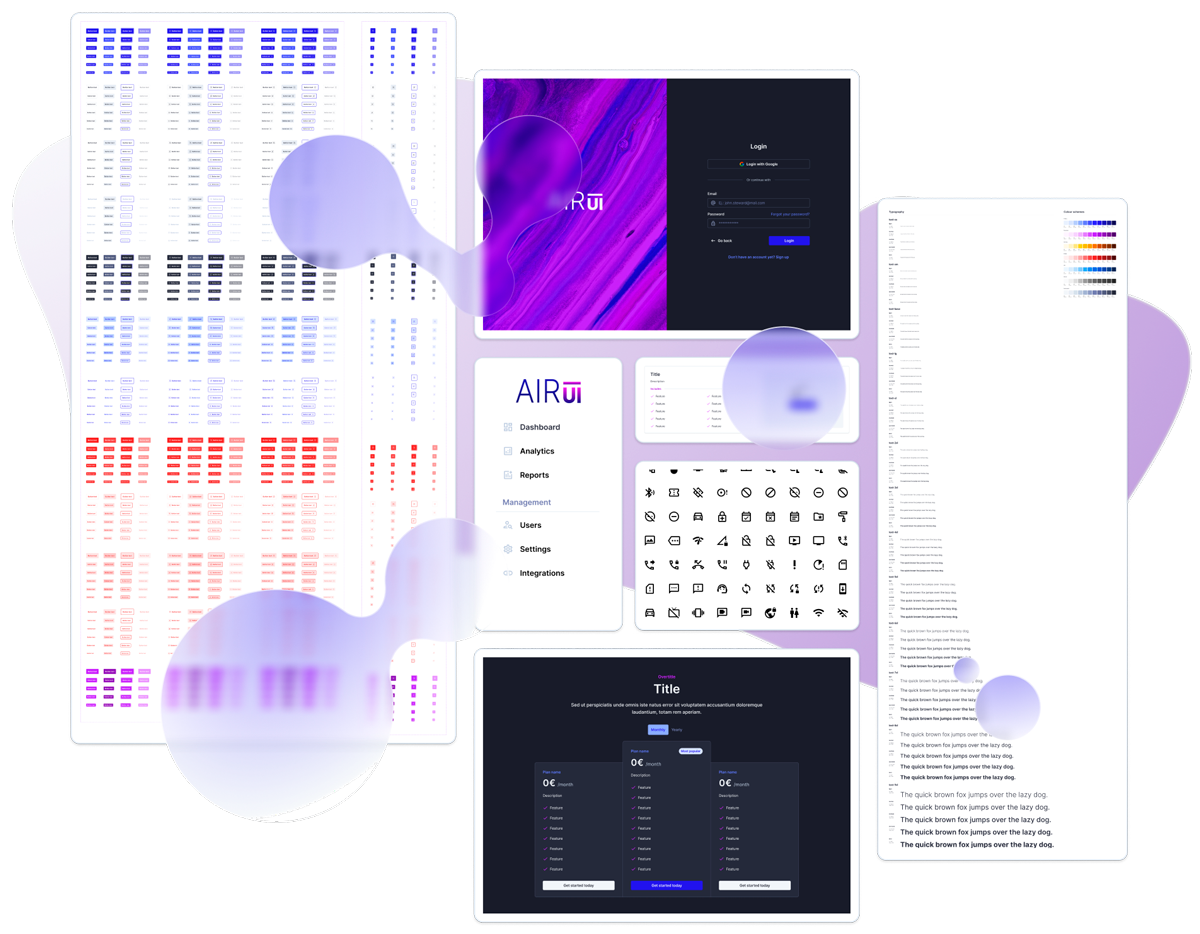
Build Nuxt apps faster with AirUI
A lightweight, flexible UI framework for Nuxt, powered by Tailwind CSS. Fully customizable and built for speed.
- Built with Tailwind CSS
Utility-first styling with full design freedom.
- Optimized for Nuxt
Auto-imported components, composables, and stores, with no config needed.
- Type-safe with TypeScript
Fully typed API surface for a smoother developer experience.
Built using the latest Vue and Nuxt features.
Easy integration with thousands of icons out of the box.
Add or override fonts effortlessly via CSS variables.
Automatic and manual theme switching with semantic colors.
Built with internationalization in mind.
Fast, lightweight, and scalable by default.
Consistent design system
A powerful foundation of tokens, themes, and design rules that ensures visual consistency across your app.
- CSS variables & theming
Customize spacing, typography, and color tokens with ease.
- Semantic color system
Design with clarity using meaningful color names.
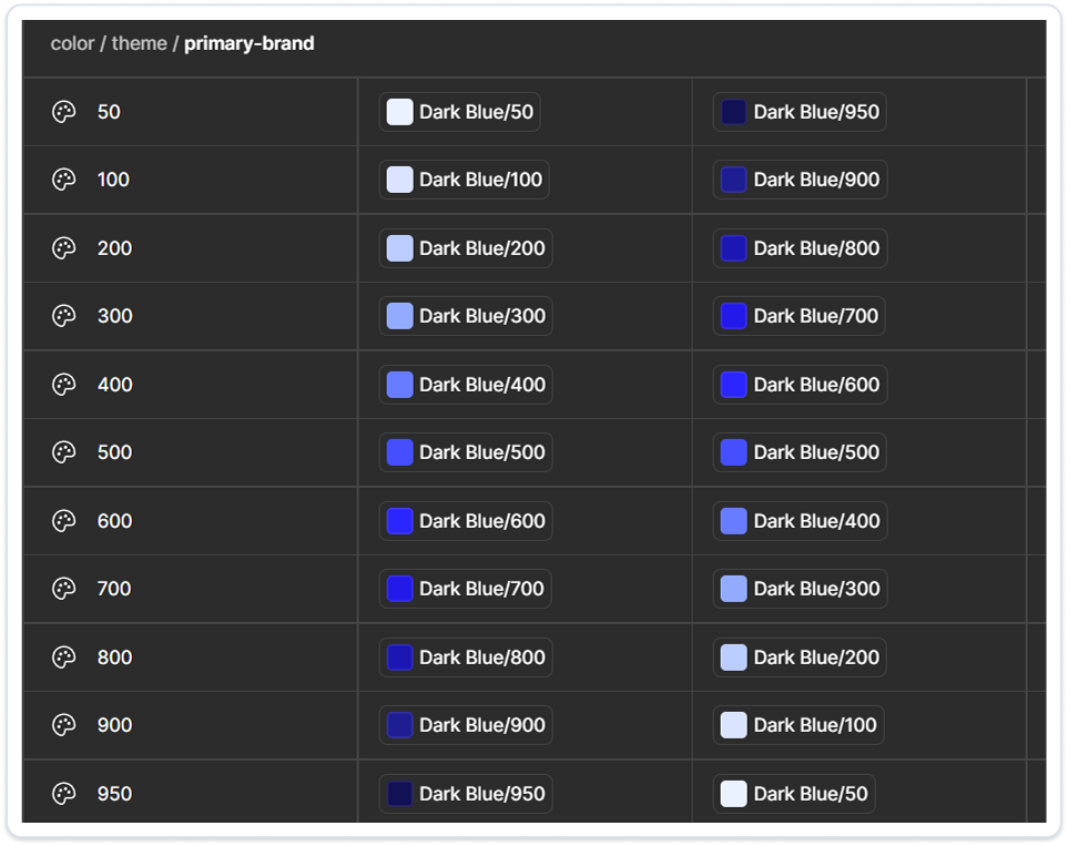
- Fast theme sync from Figma
Import Figma's project theme tokens and quickly update your app's styles via script, with no rebuild required.
Flexible & customizable components
A rich set of production-ready UI components built for Nuxt and styled with Tailwind. Easy to adapt to any project.
- Complete component library
Forms, tables, modals, alerts, menus, tabs, and more, ready to use in your project.
- Tailwind-first customization
Override styles using utility classes or extend with your own Tailwind config.
- Flexible by design
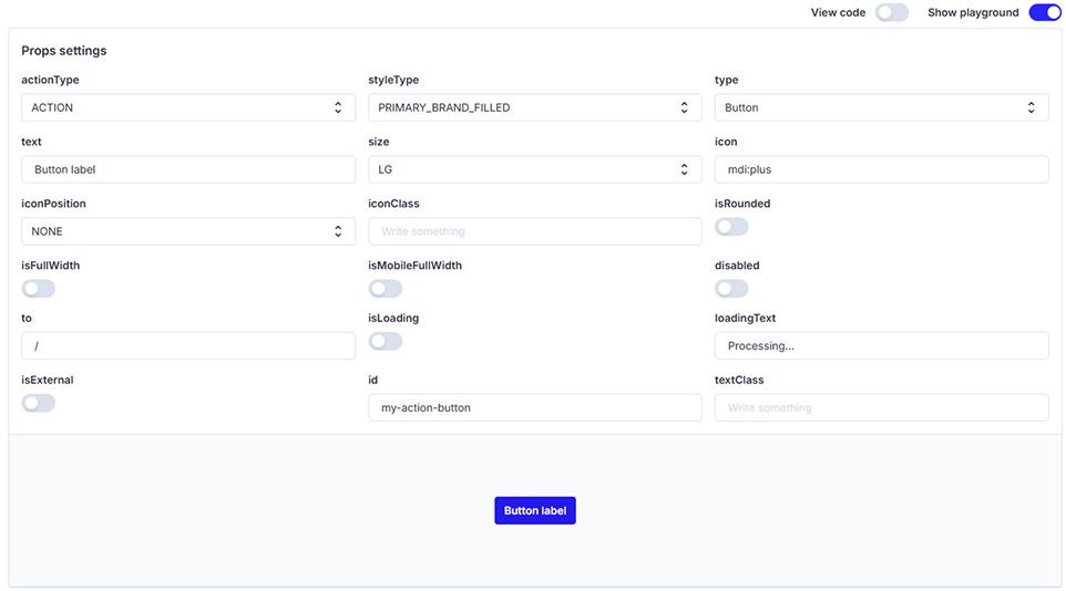
Every component is built to be composable, prop-driven, and adaptable to your specific UI needs.